The waterfall chart is a useful and common visualization to show both quantity and change over time, and how a quantity that starts from one amount gets to the end amount. This is common in financial plots, where you'd like to plot one period's results, and then "waterfall" to the next period's results, with things like profits and losses.
This post will demonstrate how to create waterfall charts, very simply, in python, using Matplotlib and Plotly. Skip to the section of interest using the links below:
For all of the examples below, we'll show a waterfall of the monetary balance of a company in Q2 and then how that balanced changed and settled in Q3.
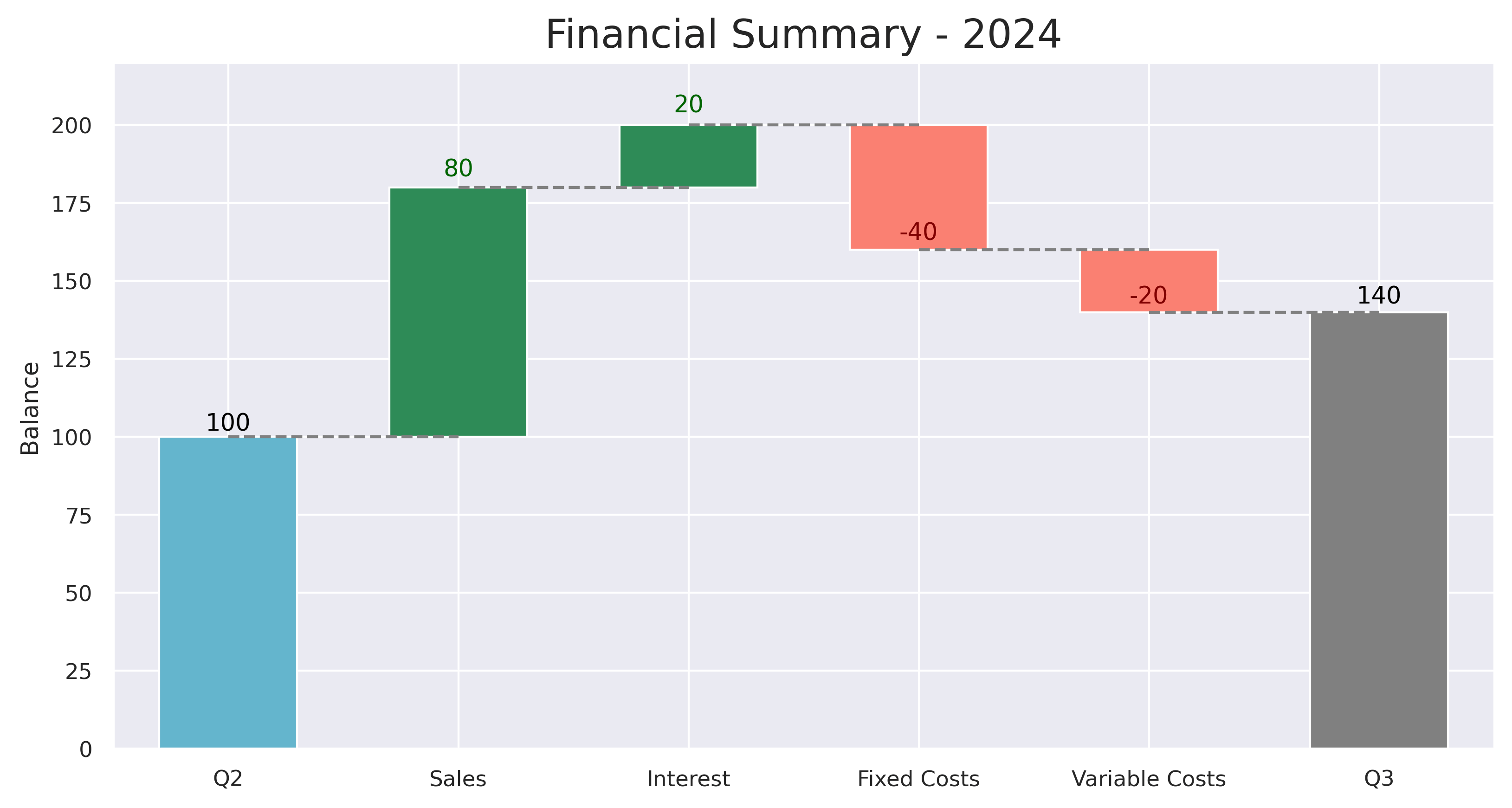
Matplotlib Charts
First, we'll demonstrate a simple waterfall chart in Matplotlib. It's a bit more verbose, but not too bad, and as always, very flexible.
from matplotlib import pyplot as plt
import numpy as np

# Labels for each bar.
categories = ['Q2', 'Sales', 'Interest', 'Fixed Costs', 'Variable Costs', 'Q3']

# Relative values. Note, the last bar for "Q3" is auto-calculated, so not given.
values = [100, 80, 20, -40, -20]

# Calculate the cumulative sum.
cumulative_values = np.cumsum(values)

# Create the waterfall chart
fig, ax = plt.subplots()

# Plot the bars
for i in range(len(values)):
    if i == 0:
        color = 'dodgerblue'
    elif values[i] >= 0:
        color = 'green'
    else:
        color = 'firebrick'
    ax.bar(
        categories[i],
        values[i],
        bottom=cumulative_values[i] - values[i],
        color=color
    )
# Plot the last bar.
ax.bar(categories[-1], cumulative_values[-1], color='dodgerblue')

# Add labels and title
ax.set_title('Financial Summary - 2024')
ax.set_ylabel('Balance ($)')

# Set x-axis labels to the middle of the bars
plt.xticks(rotation=30, ha='right')
plt.show()

A nice, simple, waterfall chart. Let's move on to Plotly.
Plotly Waterfall Charts
Plotly makes it even easier to create waterfall charts, since it has a dedicated class/function to do so.
import plotly.graph_objects as go

fig = go.Figure(go.Waterfall(
    name = "Balance",
    orientation = "v",
    measure = ["absolute", "relative", "relative", "relative", "relative", "total"],
    x = ['Q2', 'Sales', 'Interest', 'Fixed Costs', 'Variable Costs', 'Q3'],
    textposition = "outside",
    text = ["Q2", "+80", "+20", "-40", "-20", "Q3"],
    y = [100, 80, 20, -40, -20, 0],
    connector = {"line": {"color": "gray"}},
))

fig.update_layout(
    title = "Financial Summary - 2024",
    showlegend = True
)

fig.show()
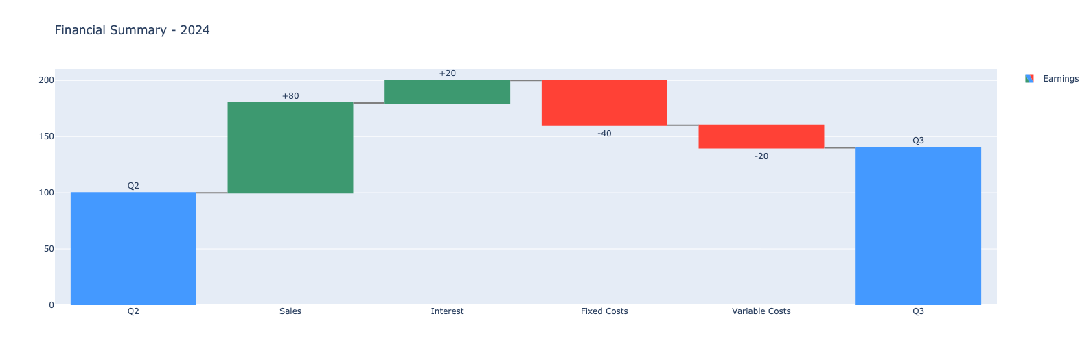
Maybe a little nicer than Matplotlib, with some bells and whistles too. See the Colab linked at the top to see the chart's interactivity in action.
Waterfall AX Matplotlib Charts
Lastly, we'll use a library built and maintained by Microsoft, called waterfall_ax, to very simply create a Matplotlib-based waterfall chart, but with less work.
# Relative values. Note, the last bar for "Q3" is auto-calculated, so not given.
values = [100, 80, 20, -40, -20]
step_names = ['Q2', 'Sales', 'Interest', 'Fixed Costs', 'Variable Costs']
last_step_label = 'Q3'
metric_name = 'Balance'

# Calculate the cumulative sum.
cumulative_values = list(np.cumsum(values))

# Plot
waterfall = WaterfallChart(
    cumulative_values,
    step_names=step_names,
    metric_name=metric_name,
    last_step_label=last_step_label
)
wf_ax = waterfall.plot_waterfall(title='Financial Summary - 2024')
plt.show()
That's it!
This was a simple demo on creating waterfall plots in python, using three different methods. Hope you enjoyed.