This article gives a short intro into creating box plots with Matplotlib. There are a lot of customizations you can do with the library, but we'll limit this post to a very simple version, and then a box plot with custom colors and labels.
Box plots are great tools to summarize groups of data, and their underlying distributions, against each other. They show the median of the underlying data, where half of the data sits within that distribution (25th to 75th percentile), and then how skewed the distribution is in both direction, optionally showing extreme outliers.
A simple Matplotlib box plot
We start with the simplest box plot we can create with Matplotlib, just using some fake data.
from matplotlib import pyplot as plt
import numpy as np

# Sample data
data = [np.random.normal(0, 1, 20), np.random.normal(5, 1.5, 20)]

# Create the box plot
plt.boxplot(data)

# Customize the plot (optional)
plt.title("Simple Box Plot")
plt.xlabel("Groups")
plt.ylabel("Values")

# Show the plot
plt.show()
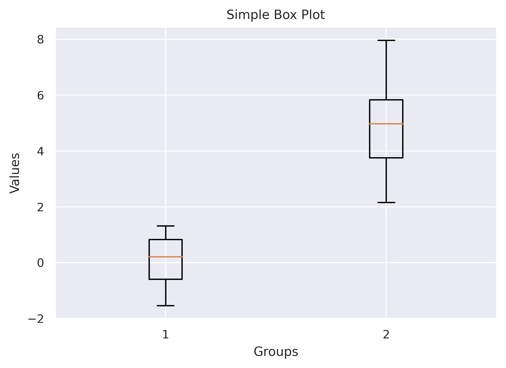
data is just two sets of data points, given as a list of arrays, which are then converted into separate box plots.
In the next section, we'll see how we can style these up a bit.
Box plots in Matplotlib with custom colors and labels
Adding labels to each box plot is simple, and only involves an additional argument to the function, but custom colors are a bit more involved.
# Sample data for four groups
data = [
    np.random.normal(0, 1, 20),
    np.random.normal(5, 1.5, 20),
    np.random.normal(10, 2, 20),
    np.random.normal(15, 2.5, 20),
]

# Colors for each box
colors = ['lightblue', 'lightgreen', 'lightcoral', 'lightyellow']
# Corresponding labels
labels = ['Blueberries', 'Lettuce', 'Cantelope', 'Corn']

fig, ax = plt.subplots()

# Create the box plot with custom colors
boxp = ax.boxplot(
    data,
    patch_artist=True, # Needed to later set the colors
    labels=labels,
)

# Customize the plot (optional)
ax.set_title("Box Plot with Four Groups")
ax.set_xlabel("Groups")
ax.set_ylabel("Values")

# Set the colors for each box
for patch, color in zip(boxp["boxes"], colors):
    patch.set_facecolor(color)

# Show the plot
plt.show()
